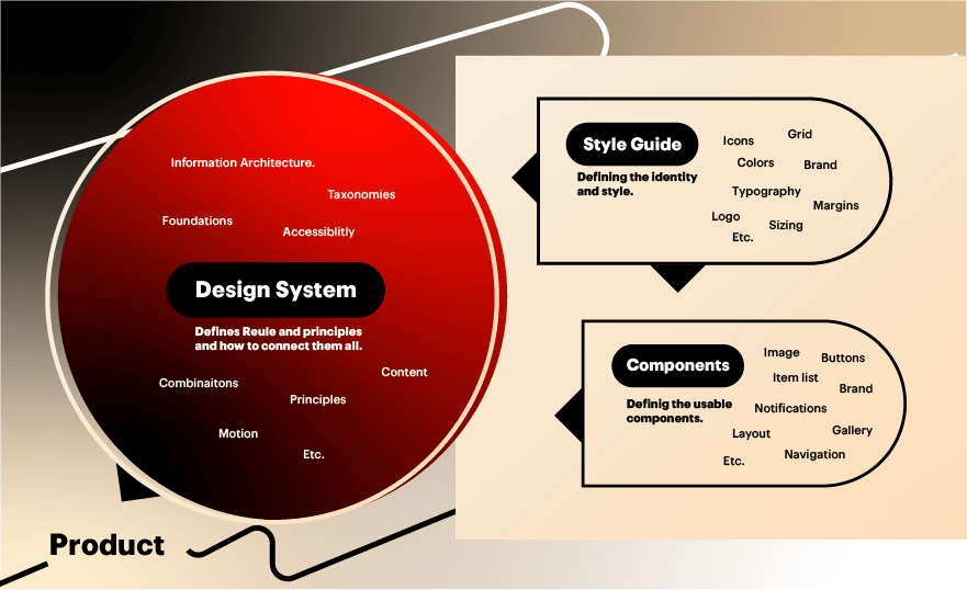
🎨✨ Design Systems 101: Structuring for Consistency & Scalability ✨📐
🎨✨ Design Systems 101: Structuring for Consistency & Scalability ✨📐
Building a scalable and consistent design system is like constructing a Lego set — every piece must fit perfectly to create a stunning final product! 🧱🏗️ In this blog, we’ll break down Design System Structuring, explain key concepts with examples, and explore how to maintain uniformity across releases.

🔹 What is a Design System?
A Design System is a collection of reusable components, guidelines, and standards that ensure consistency across an application. Think of it as a single source of truth for designers and developers.
Example:
- Google’s Material Design defines buttons, typography, and animations.
- Apple’s Human Interface Guidelines standardize iOS app behavior.
🔹 Key Concepts of Design System Structuring
1. 🧩 Atomic Design Methodology
Brad Frost’s Atomic Design breaks UI into smaller, reusable parts:
- Atoms → Basic elements (buttons, inputs)
- Molecules → Groups of atoms (search bar = input + button)
- Organisms → Complex components (navbar = logo + menu + search)
- Templates → Page layouts
- Pages → Final UI with real content
Example:
- Atom:
<Button variant="primary"> - Molecule:
<SearchBar onSubmit={handleSearch} /> - Organism:
<Header logo={<Logo />} navItems={[...]} />
2. 🎨 Design Tokens (The Core Styling)
Design tokens store visual attributes like colors, spacing, and typography in a central file (JSON/JS).
Example:
{
  "colors": {
    "primary": "#4F46E5",
    "secondary": "#10B981"
  },
  "spacing": {
    "small": "8px",
    "medium": "16px"
  }
}
Usage in CSS/JS:
.button {
  background: var(--color-primary);
  padding: var(--spacing-medium);
}
✅ Ensures consistency even if branding changes!
3. 📚 Component Library (Reusable UI Building Blocks)
A component library (React/Vue/Angular) contains pre-built, documented UI elements.
Example:
- Button Component
<Button
  variant="primary"
  size="medium"
  onClick={handleClick}
>
  Click Me
</Button>- Card Component
<Card
  title="Product Card"
  image="/product.png"
  footer={<Button>Buy Now</Button>}
/>
📌 Benefits:
✔ Faster development
✔ Consistent look & behavior
✔ Easier maintenance
4. 📜 Documentation (The Rulebook)
Every design system must have clear documentation:
- Usage guidelines (when to use a dropdown vs. radio)
- Code snippets
- Accessibility standards
- Versioning & changelog
Example:
Button Component
- Primary Button: For main actions (Submit, Confirm)
- Secondary Button: For less important actions (Cancel)
- Disabled State:
disabled={true}
🔄 How to Maintain Consistency Across Releases?
1. 🏷️ Version Control (Like Software Updates)
- Use semantic versioning (
v1.0.0→v1.1.0for minor updates). - Keep a changelog for tracking changes.
2. 🧪 Automated Testing (Visual Regression Tools)
- Tools like Storybook, Chromatic, or Percy detect UI inconsistencies.
3. 🤖 Design Linting (Enforce Rules Automatically)
- Use Stylelint (CSS) or ESLint (JS) to enforce coding standards.
4. 🔄 Sync Design & Code (Figma ↔ React)
- Tools like Figma Tokens or Zeroheight keep designers & devs aligned.
🚀 Final Thoughts
A well-structured Design System ensures:
✅ Faster development (reusable components)
✅ Brand consistency (design tokens)
✅ Easier maintenance (documentation & versioning)
Start small, iterate, and watch your app’s UI shine uniformly across every release! ✨
💬 What’s your biggest challenge with Design Systems? Drop a comment! 👇
#DesignSystems #UIUX #FrontendDev #WebDesign #AtomicDesign
Comments
Post a Comment