🚀 Build Your Own ReactJS Library: A Complete Step-by-Step Guide to Publish Reusable Components 📦
🚀 Build Your Own ReactJS Library: A Complete Step-by-Step Guide to Publish Reusable Components 📦
In modern frontend development, reusability and modularity are key principles. Instead of rewriting the same components again and again, developers create React libraries that can be reused across multiple projects.
Many popular UI frameworks like Material UI, Ant Design, and Chakra UI started as reusable component libraries.

In this guide, you’ll learn how to create, structure, build, and publish your own ReactJS library step-by-step. 🧑💻
🎯 Why Create a React Library?
Creating a library helps you:
✅ Reuse components across projects
✅ Maintain consistent UI design
✅ Share components with other developers
✅ Improve development speed
✅ Build open-source credibility
Example:
Instead of rewriting a Button component in every project, you can create a reusable library.
🧠 Step 1: Define Your Library Idea
Before coding, decide:
✔ What problem your library solves
✔ What components it includes
✔ Who will use it
Example libraries:

Example Library Idea:
react-awesome-uiComponents:
- Button
- Card
- Modal
- Loader
⚙️ Step 2: Setup Your React Library Project
Create a project folder.
mkdir react-awesome-ui
cd react-awesome-ui
npm init -y
Install essential dependencies.
npm install react react-domInstall development tools.
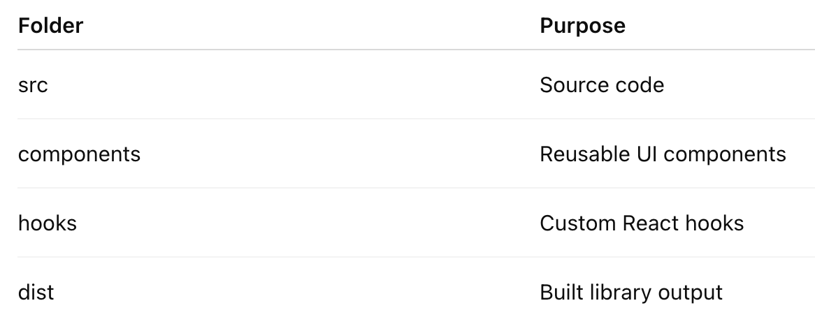
npm install --save-dev typescript rollup rollup-plugin-typescript2📁 Step 3: Recommended Folder Structure
A good folder structure makes your library scalable.
react-awesome-ui
│
├── src
│   ├── components
│   │   ├── Button
│   │   │   ├── Button.jsx
│   │   │   ├── Button.css
│   │   │   └── index.js
│   │   │
│   │   ├── Card
│   │   │   ├── Card.jsx
│   │   │   └── index.js
│   │
│   ├── hooks
│   │   └── useToggle.js
│   │
│   └── index.js
│
├── dist
├── package.json
├── rollup.config.js
├── README.md
└── .gitignore
📌 Important folders:
🧩 Step 4: Create Your First Component
Example: Button Component
// src/components/Button/Button.jsx

import React from "react";
import "./Button.css";

const Button = ({ children, onClick }) => {
  return (
    <button className="awesome-btn" onClick={onClick}>
      {children}
    </button>
  );
};

export default Button;
Button Styling:
/* Button.css */

.awesome-btn {
  background: #4f46e5;
  color: white;
  padding: 10px 18px;
  border: none;
  border-radius: 6px;
  cursor: pointer;
}
📦 Step 5: Export Components
Create a central export file.
// src/index.js
export { default as Button } from "./components/Button/Button";
export { default as Card } from "./components/Card/Card";
This allows users to import easily:
import { Button } from "react-awesome-ui";⚙️ Step 6: Configure Rollup Bundler
Libraries need bundling before publishing.
Create:
// rollup.config.js

import typescript from "rollup-plugin-typescript2";

export default {
  input: "src/index.js",
  output: [
    {
      file: "dist/index.js",
      format: "cjs"
    },
    {
      file: "dist/index.es.js",
      format: "esm"
    }
  ],
  plugins: [typescript()]
};
Build command:
npx rollup -cOutput:
dist/
  index.js
  index.es.js
🧪 Step 7: Test Your Library Locally
Before publishing, test locally.
Use:
npm linkThen in another React project:
npm link react-awesome-uiUse component:
import { Button } from "react-awesome-ui";

function App() {
  return <Button>Click Me</Button>;
}
🌍 Step 8: Publish Library to npm
Login to npm.
npm loginUpdate package.json.
{
 "name": "react-awesome-ui",
 "version": "1.0.0",
 "main": "dist/index.js",
 "module": "dist/index.es.js"
}
Publish:
npm publishNow your library is live on npm 🎉
Developers can install it:
npm install react-awesome-ui🔥 Step 9: Add TypeScript Support (Recommended)
Add type definitions.
Install:
npm install typescript --save-devExample:
// Button.tsx

type ButtonProps = {
  children: React.ReactNode
  onClick?: () => void
}

const Button = ({ children, onClick }: ButtonProps) => {
  return <button onClick={onClick}>{children}</button>
}
Benefits:
✔ Better developer experience
✔ Autocomplete support
✔ Type safety
📖 Step 10: Write Good Documentation
Create a strong README.md.
Example:
# React Awesome UI

Install:
npm install react-awesome-ui

Usage:
import { Button } from "react-awesome-ui";
Add:
- Installation guide
- Examples
- API documentation
- Screenshots
⚡ Best Rules for React Library Development
1️⃣ Keep Components Independent
Each component should work without relying on others.
❌ Bad
Button requires Card component✅ Good
Button works independently2️⃣ Avoid Heavy Dependencies
Too many dependencies increase bundle size.
Good libraries remain lightweight.
3️⃣ Follow Semantic Versioning
Example:
1.0.0
1.1.0
2.0.0
Use Semantic Versioning
4️⃣ Use Tree Shaking
Export components individually.
export { Button }
export { Card }
This reduces bundle size.
❌ Common Mistakes to Avoid
🚫 1. Hardcoding Styles
Bad:
font-size: 14pxGood:
Use props or theme support.
🚫 2. Not Testing Components
Always test:
✔ responsiveness
✔ accessibility
✔ edge cases
🚫 3. Ignoring Documentation
Even great libraries fail without documentation.
🚫 4. Large Bundle Size
Avoid importing full libraries unnecessarily.
Example:
import lodashUse:
import lodash/debounce🌟 Pro Tips for Making Your Library Popular
🔥 1. Open Source on GitHub
Host it on GitHub.
🔥 2. Add Examples
Create demo projects.
Use tools like:
- Storybook
- Vite
🔥 3. Write Developer Blogs
Explain your library’s features.
🔥 4. Keep Updates Frequent
Regular updates improve adoption.
🎯 Final Thoughts
Creating a React library is one of the best ways to level up as a frontend developer.
It helps you:
🚀 Build reusable systems
🚀 Improve architecture thinking
🚀 Contribute to open source
🚀 Grow your developer reputation
Who knows? Your library might become the next Material UI or Chakra UI! 😄


Comments
Post a Comment