🎨 The Ultimate UI Architecture Blueprint (2026)
🎨 The Ultimate UI Architecture Blueprint (2026)
How to Design Beautiful, Scalable, User-Centric Applications Like the World’s Best Products 🚀
“Users don’t remember your code. They remember how your application made them feel.”
Every successful application — from Apple, Airbnb, Spotify, Linear, Notion, Figma, Google, and Stripe — follows a structured UI architecture.
A beautiful interface is not about colors or animations.
It is about creating a design system that scales, minimizes cognitive load, improves accessibility, and increases conversions.
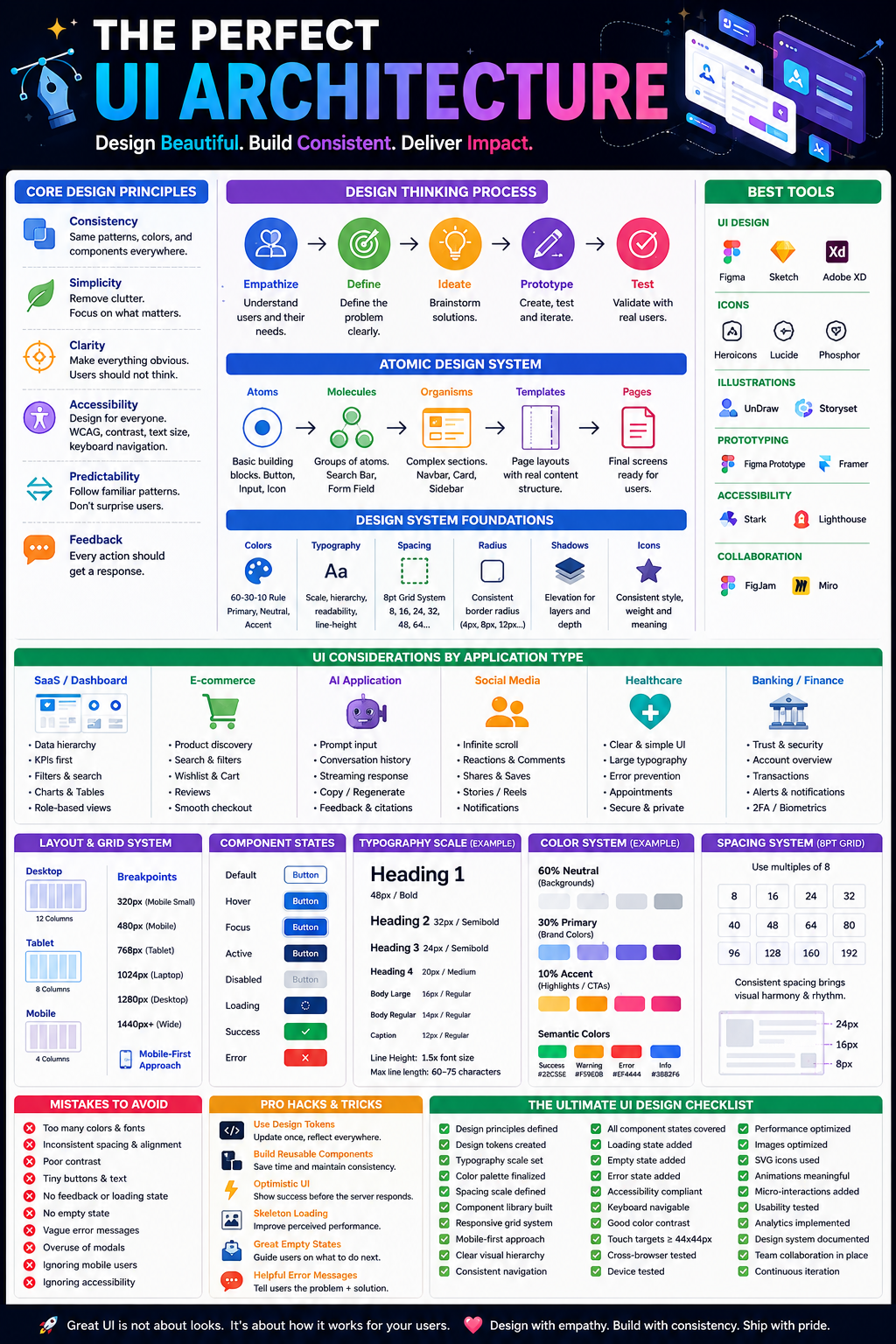
This guide explains everything required to build a world-class UI architecture.
📚 Table of Contents
- What is UI Architecture?
- Core Design Principles
- Visual Hierarchy
- Design Thinking Process
- Atomic Design
- Information Architecture
- Design Systems
- Grid Systems
- Typography
- Color Theory
- Spacing Systems
- Components
- Layout Architecture
- Navigation Design
- Mobile vs Desktop
- Responsive Design
- Accessibility
- UX Psychology
- Micro-interactions
- Animations
- Dark Mode
- Forms
- Dashboards
- SaaS UI
- E-commerce UI
- AI Application UI
- Social Media UI
- Healthcare UI
- Banking UI
- Common Mistakes
- Best Tools
- Pro Hacks
- Complete Checklist
🎯 What is UI Architecture?
UI Architecture is the systematic organization of every visual and interactive element inside an application.
Instead of designing screens individually, you build reusable building blocks.
Think of it like LEGO.
Colors
 ↓
Typography
 ↓
Buttons
 ↓
Cards
 ↓
Sections
 ↓
Pages
 ↓
Entire Application
🧠 The Golden Principles
1. Consistency
Every screen should feel like part of the same product.
Bad
Button Radius:
8px
12px
20px
5px
Good
Every button:
Radius 12px
2. Simplicity
Remove unnecessary elements.
Ask:
“If I remove this, will users notice?”
If not…
Delete it.
3. Clarity
Users should never think.
Instead of
ProceedUse
Continue to Payment4. Accessibility
Every person should be able to use your application.
Support
- Keyboard navigation
- Screen readers
- Color blindness
- Large text
- High contrast
5. Predictability
Never surprise users.
Example
Trash icon
🗑 = Delete
Not
Archive
6. Feedback
Every action needs a response.
Button Click
↓
Loading
↓
Success
↓
Confirmation
Never leave users wondering.
🏗 Atomic Design
The most scalable architecture.
Atoms
Button
Input
Avatar
Icon
↓
Molecules
Search Bar
Login Form
↓
Organisms
Navbar
Sidebar
Footer
↓
Templates
Dashboard
↓
Pages
Example
Button
↓
Login Form
↓
Authentication Page
↓
Authentication Module
📦 Information Architecture
Users must always know
- Where they are
- Where they came from
- Where to go next
Example
Dashboard
>
Orders
>
Invoice
>
Payment
Breadcrumbs reduce confusion.
🎨 Typography System
Limit fonts.
Example
Heading
48
32
24
20
18
16
14
12
Line Height
1.5x font sizeAvoid
15 fonts
10 weights
Random sizes
🌈 Color System
The 60–30–10 Rule
60%
Neutral
30%
Primary
10%
Accent
Example
Background
White
Text
Dark Gray
Buttons
Blue
Warning
Orange
Danger
Red
Success
Green
Never rely on color alone — pair it with icons or text for status indicators.
📏 8-Point Grid System
Everything should follow multiples of 8.
8
16
24
32
40
48
64
80
96
Benefits
✅ Perfect alignment
✅ Better responsiveness
📐 Layout Principles
Header
----------------------
Sidebar
Main Content
----------------------
Footer
Keep
- whitespace
- margins
- alignment
consistent.
📱 Responsive Design
Desktop
12 ColumnsTablet
8 ColumnsMobile
4 ColumnsBreakpoints
320
480
768
1024
1280
1440
1920
Design mobile-first to prioritize essential content.
🧩 Component Architecture
Every component should have
States
Default
Hover
Focus
Active
Disabled
Loading
Error
Success
Example
Button
Small
Medium
Large
Primary
Secondary
Outline
Ghost
🎭 UX Psychology
Hick’s Law
More choices
↓
Slower decisions
Example
Netflix
Few visible buttons
Easy selection
Fitts’ Law
Large buttons
↓
Easy clicking
Miller’s Law
Humans remember
7 ± 2 items
Avoid huge menus.
Jakob’s Law
Users expect familiar patterns.
Don’t reinvent navigation.
Gestalt Principles
- Proximity
- Similarity
- Continuity
- Closure
- Common Region
Use grouping and alignment to make interfaces easier to scan.
⚡ Micro-interactions
Examples
❤️ Like animation
✔ Checkbox animation
🔄 Loading spinner
🎉 Success celebration
They improve perceived quality.
✨ Animation Rules
Duration
150ms
200ms
300ms
Never
1000msToo slow.
Use animation to explain changes, not distract from them.
🌙 Dark Mode
Never invert colors directly.
Use
#121212
instead of
Black
Maintain contrast
4.5:1 minimum for normal text.
📄 Forms
Always
Label
↓
Input
↓
Helper Text
↓
Validation
Example
Email
Input
Must be valid email
❌ Wrong email
✔ Looks good
Best Practices
- Inline validation
- Auto-focus when appropriate
- Preserve entered data after errors
- Show password toggle
📊 Dashboard UI
Always prioritize
- KPIs
- Charts
- Filters
- Tables
- Details
Avoid information overload.
🛒 E-commerce UI
Must include
- Search
- Categories
- Wishlist
- Cart
- Reviews
- Similar Products
- Checkout Progress
- Trust Indicators
🤖 AI Application UI
AI interfaces require
- Prompt input
- Conversation history
- Streaming responses
- Citations (where applicable)
- Copy button
- Regenerate
- Edit prompt
- Feedback controls
- Model selection (if relevant)
💬 Social Media UI
Focus
- Infinite scroll (carefully optimized)
- Reactions
- Comments
- Sharing
- Notifications
- Stories/Reels
- Creator analytics
🏥 Healthcare UI
Requirements
- Large typography
- Clear icons
- Error prevention
- Accessibility
- Secure patient workflows
- Easy appointment flows
🏦 Banking UI
Prioritize
- Security
- Trust
- Transaction history
- Confirmation screens
- Fraud alerts
- Multi-factor authentication
- Clear account balances
🛠 Best Design Tools
UI Design
- Figma
- Penpot (Open Source)
- Sketch (macOS)
- Adobe XD (legacy projects)
Icons
- Heroicons
- Lucide
- Phosphor
- Material Symbols
Illustrations
- unDraw
- Storyset
- ManyPixels
Design Systems
- Material Design
- Apple Human Interface Guidelines
- Fluent Design
- Ant Design
Accessibility
- Stark
- Axe DevTools
- Lighthouse
Prototyping
- Figma Prototype
- ProtoPie
- Framer
Collaboration
- FigJam
- Miro
🚫 Biggest UI Mistakes
❌ Too many colors
❌ Tiny buttons
❌ Inconsistent spacing
❌ Poor contrast
❌ Too many fonts
❌ No loading state
❌ No empty state
❌ Poor error messages
❌ Overuse of modals
❌ Ignoring keyboard navigation
❌ Pixel-perfect without user testing
❌ Inconsistent icon styles
🔥 Pro Hacks
1. Use Design Tokens
{
  "color.primary": "#2563EB",
  "spacing.4": "16px",
  "radius.md": "12px",
  "font.size.body": "16px"
}
One change updates the entire application.
2. Build Once, Reuse Everywhere
Create reusable:
- Buttons
- Inputs
- Cards
- Tables
- Modals
- Toasts
3. Optimize Perceived Performance
- Skeleton loaders instead of blank screens
- Progressive image loading
- Lazy loading for non-critical sections
- Optimistic UI for fast feedback
4. Design for Empty States
Instead of
No DataUse
📭 No invoices yet.
Create your first invoice.
5. Error Messages That Help
Instead of
Something went wrongUse
Couldn't save changes.
Check your internet connection and try again.
6. Measure Before Redesigning
Track:
- Time to complete tasks
- Error rates
- Click heatmaps
- Conversion funnels
- Accessibility audits
📋 The Ultimate UI Design Checklist
Foundations
- ✅ Define design principles
- ✅ Create design tokens
- ✅ Establish typography scale
- ✅ Create color palette
- ✅ Define spacing scale
- ✅ Standardize elevation and shadows
- ✅ Build icon guidelines
Components
- ✅ Buttons
- ✅ Inputs
- ✅ Dropdowns
- ✅ Cards
- ✅ Tables
- ✅ Modals
- ✅ Tabs
- ✅ Accordions
- ✅ Toasts
- ✅ Tooltips
- ✅ Pagination
- ✅ Navigation bars
States
- ✅ Default
- ✅ Hover
- ✅ Focus
- ✅ Active
- ✅ Disabled
- ✅ Loading
- ✅ Success
- ✅ Error
- ✅ Empty
Layouts
- ✅ Responsive grid
- ✅ Mobile-first
- ✅ Consistent spacing
- ✅ Logical hierarchy
- ✅ Clear navigation
Accessibility
- ✅ WCAG-compliant contrast
- ✅ Keyboard navigation
- ✅ Screen-reader labels
- ✅ Visible focus indicators
- ✅ Semantic HTML
- ✅ Touch targets ≥ 44×44 px
Performance
- ✅ Optimize images
- ✅ Minimize layout shifts
- ✅ Lazy load assets
- ✅ Use SVG icons
- ✅ Reduce unnecessary animations
Quality
- ✅ Design reviews
- ✅ Usability testing
- ✅ Cross-browser testing
- ✅ Device testing
- ✅ Analytics monitoring
- ✅ Component documentation
🎯 Final Thoughts
Exceptional UI architecture is the result of systems thinking, not artistic intuition alone. The strongest products invest in reusable components, consistent design tokens, accessibility, responsive layouts, thoughtful motion, and continuous user validation.
A mature design system enables teams to ship faster, reduce inconsistencies, and create interfaces that users trust. Whether you’re building a startup MVP, an enterprise dashboard, a mobile app, or an AI platform, the winning formula remains the same:
Design with purpose → Build reusable systems → Validate with users → Iterate continuously.
When these principles become part of your development culture, your UI evolves from a collection of screens into a scalable product experience that delights users and supports long-term growth.


Comments
Post a Comment